

NuDS Themes & Modes
Creating a Theming platform to enabled versions of the app for different customer segments and a highly requested Dark Mode.
Problem-space
NuDS was facing a challenge in addressing the increasing complexity of theme customization and customer requests:
A different segment (PJ, a.k.a. Companies) had already a theme, but it was done using local overrides, leading to maintenance challenges.
The need for a new theme for high-income customers was approaching. How to do this in a platform and scalable way?
Dark Mode was the #4 most requested feature in the app at the time, and #1 every month since mid 2021, considering the purpose of the BU where NuDS was allocated.
Opportunity
Investing in a Theming platform would be a relative quick win, considering the reviewed Colors foundation that brought an unified structure to centralize, manage and distribute color design tokens.
Themes enable greater product differentiation, allowing our customers to better understand the app and our offers.
Based on more than 30% of our customers (share of DAU) using the app during the night (between 6pm and 6am), an hypothesis was that Dark Mode could increase average time spent on app.
Dark Mode could help with photosensitivity and lower vision due to higher contrast, especially in low-light environments, while also reducing battery consumption on OLED devices.
On top of all this, a Theming platform could motivate teams to adopt design tokens more and more, and discontinue old NuDS versions.
Iterations
While the Themes portion was Carla's responsibility, a fellow designer on NuDS team, I was responsible for Dark Mode.
I started by auditing previous Dark Mode attempts, along with benchmarking popular apps. Some of these experiments relied on basic color inversion logic, resulting in contrast issues, overly bright colors, and readability challenges.
I also explored switching modes via primitive tokens, which improved the visual aspect somewhat, but seems very unintentional. For example, Nubank’s famous purple was too light, somewhat detracting from the brand. The solution was to focus on iterations that made the switch at the semantic token layer.
Leonardo was also pivotal in this project, allowing me to test different palettes, balancing adjustments in contrast ratios and color saturation.
Final Solution
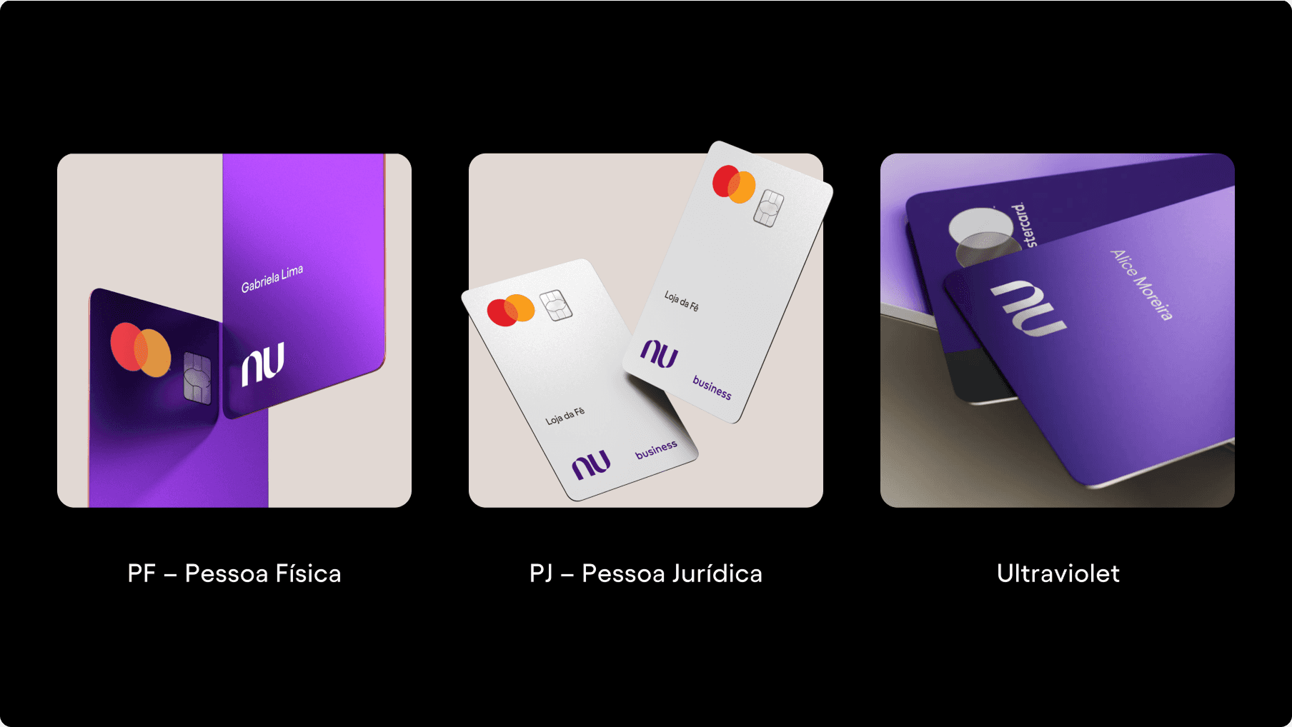
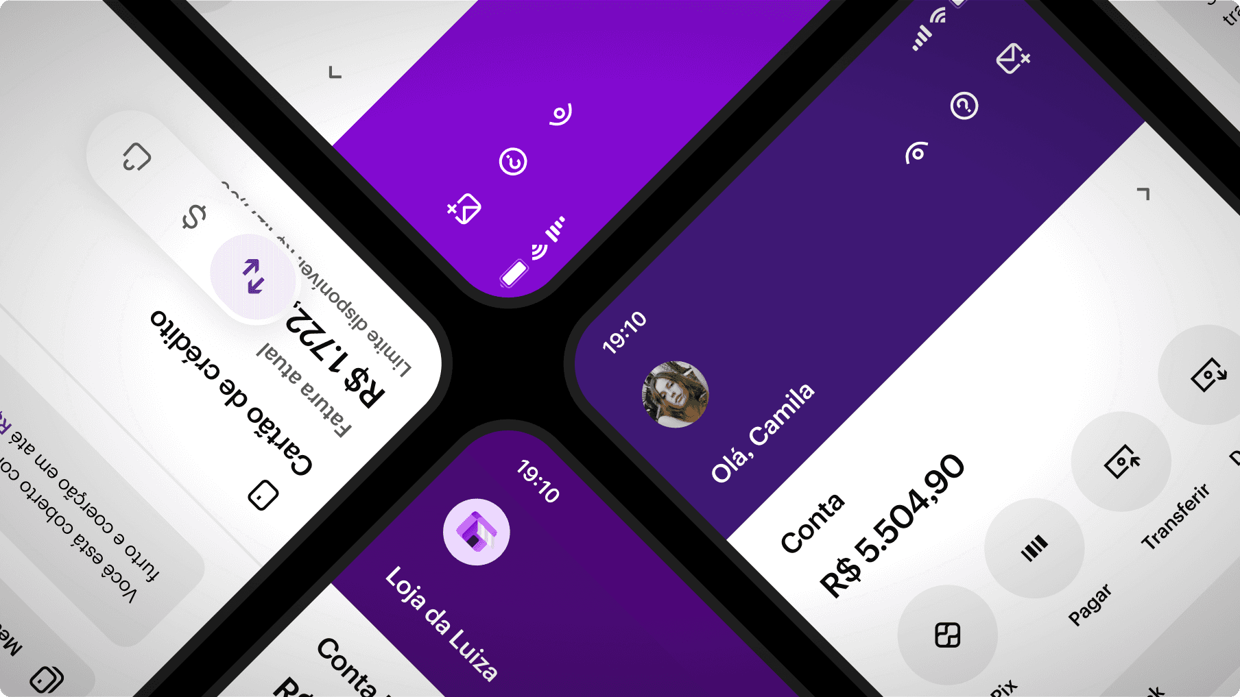
The final solution for the Theming platform involved 3 themes (Core, PJ and Ultraviolet) and 2 modes (Light and Dark).
Each theme is divided into Shared Colors (UI, feedback) and Accent Colors (differential of each segment). Before Figma Variables, we released themes and modes using the Themer plugin.
For Dark Mode, here are some of the features of the solution:
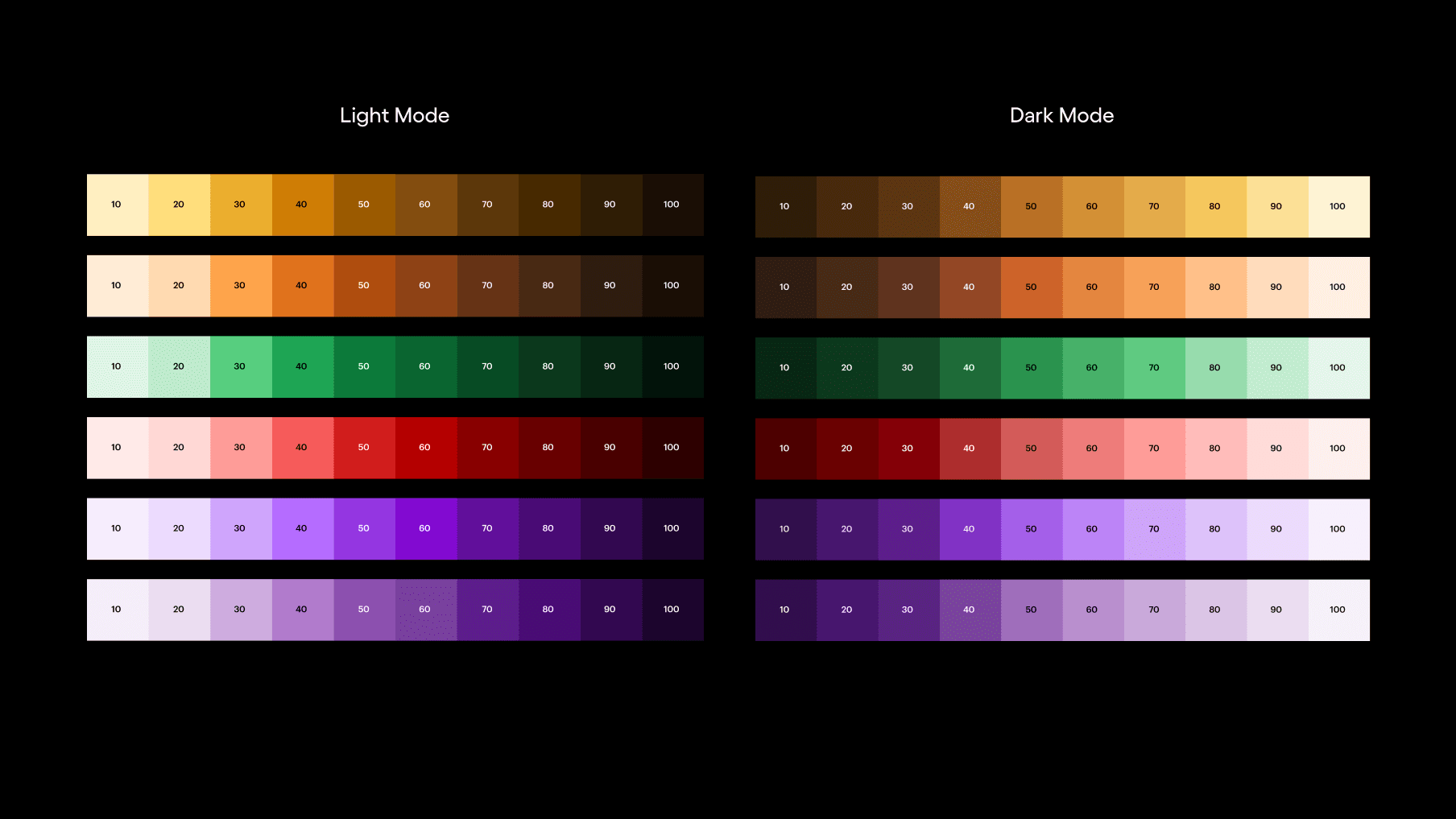
Dedicated Primitive Tokens: new palettes were necessary because of the new dark context. I changed some contrast ratios, hues, and reduced the overall saturation of the colors, so that they didn't glow like neon on the dark backgrounds.
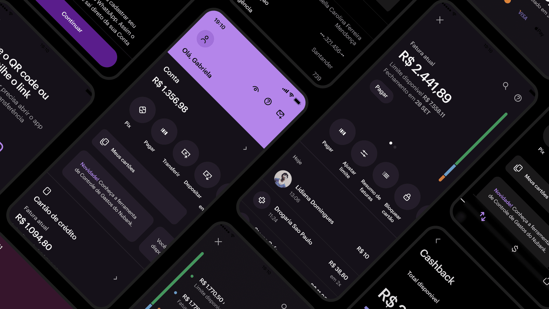
Pure black for background: Nubank's design language requires our app to look as native as possible, so we decided on pure black to match popular operating systems like iOS and Android. In addition, devices with OLED screens turn off the light to pure black pixels, saving battery power.
On Color combinations: Accent and Feedback surfaces were kept darker/more vibrant, to provide contrast with white texts. This was the solution to preserve the characteristics of Nubank's purple in Buttons, for example.
Persistent tokens: some use cases required that some colors would be kept ”the same” in Dark Mode, mainly white surfaces over the purple background. To solve these, I created some persistent tokens, but the values point to the appropriate primitives for each mode.
Agnostic illustrations: I made visual adjustments in our Illustration System to make them work well in both modes, avoiding the complexity and effort of having a dark version for each one.
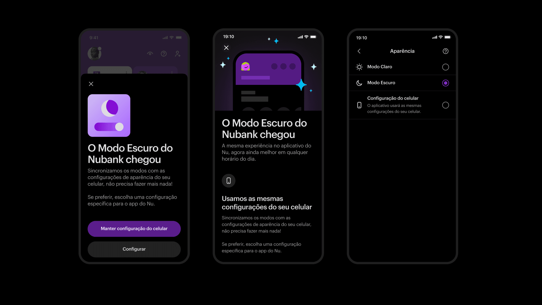
Rollout
To activate Dark Mode, users can use the Appearance menu in Settings. It can be always on or off, or simply follow the OS settings. Automatic switch was the default at launch.
We did the rollout in two phases:
An Announcement Screen that led to the Appearance menu was shown for the NuCommunity and then up to 60% of the base;
Till 93.5% of the base, an entry point in the home page was shown, remaining there for about 12 days.
Impact
Customer adoption: 32% of users introduced to the onboarding flow made it to the Appearance screen. 43% of them decided to always use Dark Mode, demonstrating high demand for the feature.
Satisfaction: Dark Mode CSAT was 84.8%, above the financial industry benchmark of 77%.
Qualitative feedback: the new Theming platform not only elevated the visual experience for users but also solidified NuDS as a flexible and robust tool for future adaptations, aligned with accessibility standards and brand identity.
We noticed a slight increase in time spent in the app at night, but we were unable to pinpoint the relationship with Dark Mode because of other parallel releases at the time.
Credits
Year: 2023
Product & Strategy: Eduardo Roder, Carla Demarchi
Research: Nathalia Martins
Design: Zé Zorzan, Carla Demarchi
Engineering: Rodrigo Máximo, Danilo Charantola, José Lima Neto
Latest work
Hi! 👋🏼
My name is Zé Zorzan.
I'm a Systems Designer helping shape Nubank's Design System.