

NuDS Iconography Guidelines
Writing iconography guidelines from an existing library, to enable consistency and contributions.
Problem-space
As our team began reviewing Foundations in 2022, Iconography was not set to be a priority. However, product teams across the organization were increasingly in need of new icons to meet growing demands. With limited capacity to support these requests, it became clear that we couldn’t be hands-on in a sustainable way.
Simultaneously, a fellow designer in the team was developing a Contribution process for components, icons, and illustrations. Yet, while we had a well-established icon library, there were no guidelines for creating new icons, nor a history of design decisions that led to the current library.
This lack of guidance limited our ability to expand the icon library in a cohesive and scalable manner, leaving teams without a reference for making their contributions.
Opportunity
I proposed dedicating a sprint to analyze, extract and document core design principles and standards about our our icon library.
These guidelines would empower designers across the organization to create their own icons with confidence and consistency, while aligning with our brand. Additionally, they would allow us to leverage one of our new Contribution processes.
Final Solution
I started by conducting an analysis of the existing icon library, comparing stylistic choices, visual rhythms, and aligning these with our brand guidelines.
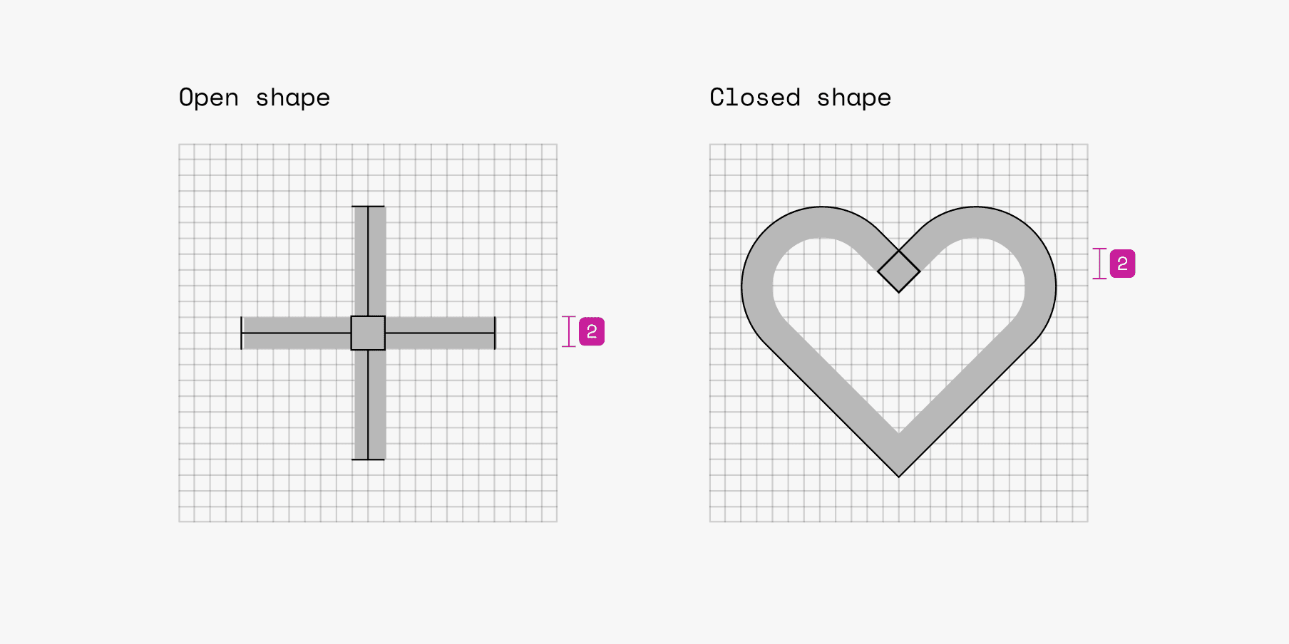
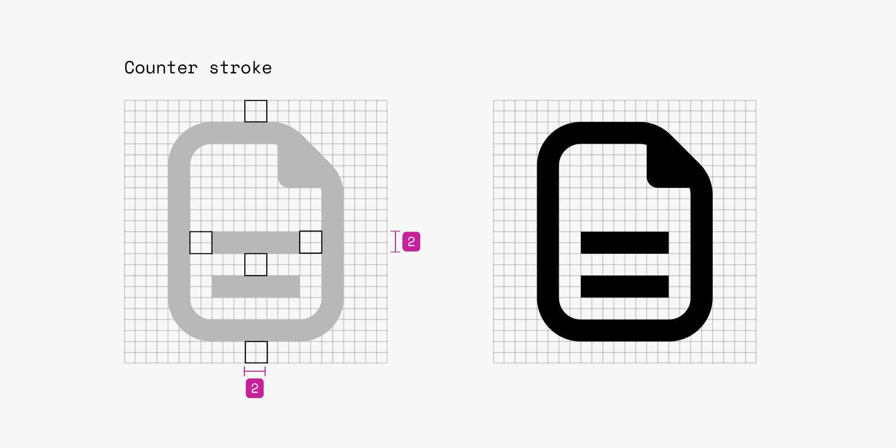
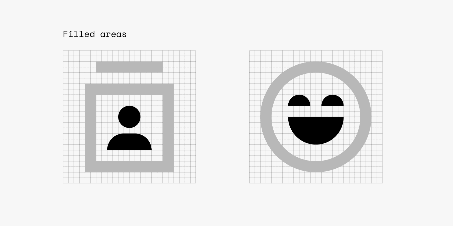
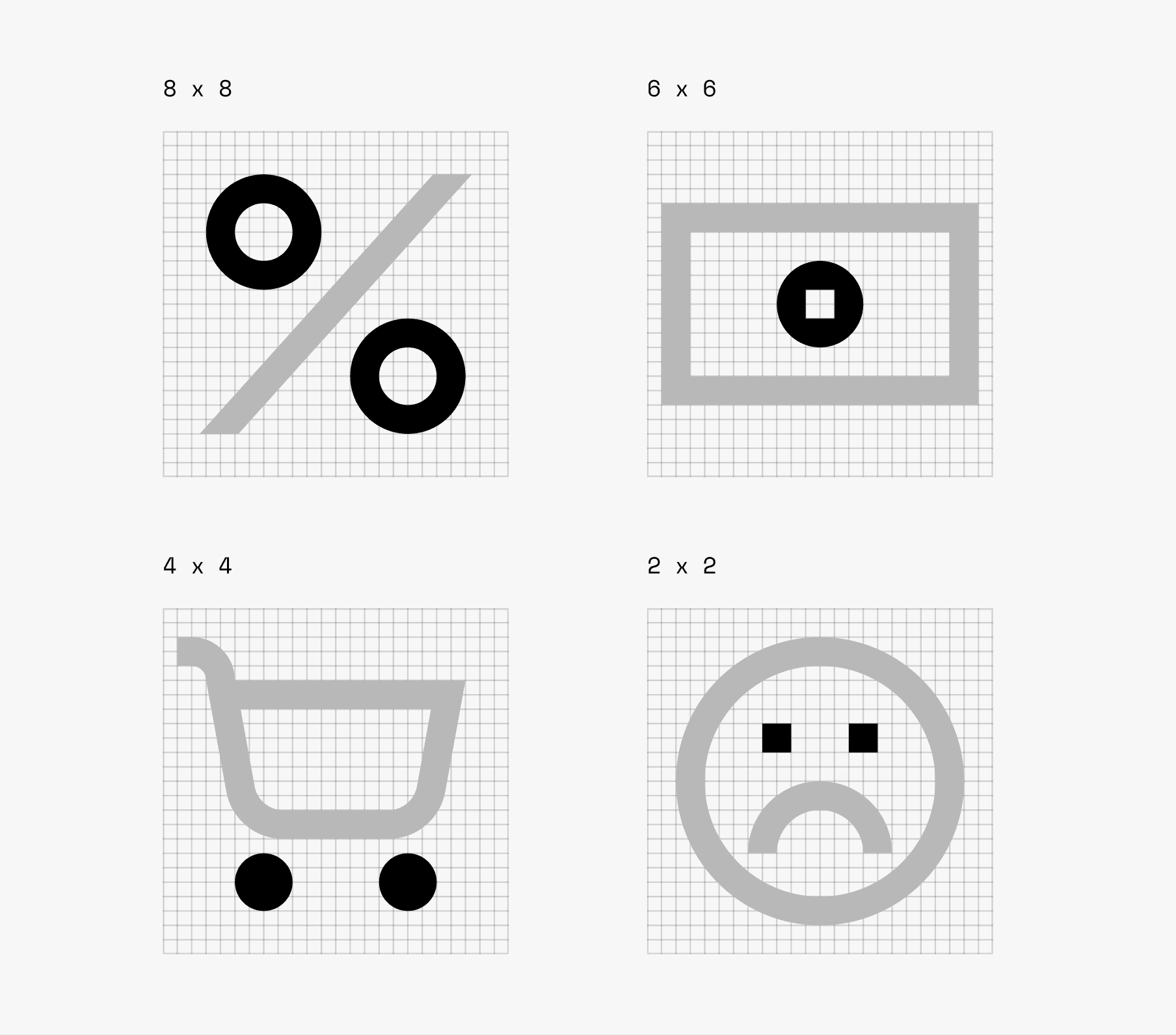
I identified key characteristics such as stroke weight, corner radius rules, line endings, how to work with modifiers and circles. Though some of these were universal iconography standards, some were definitely specific to the Nubank's brand.
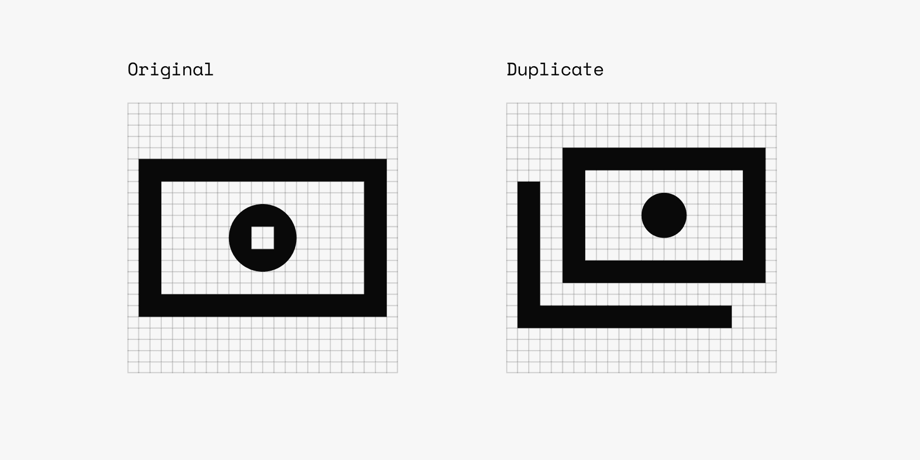
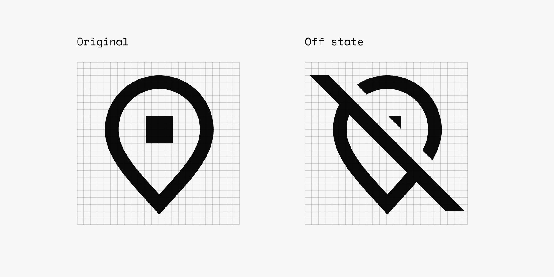
The final Iconography documentation presents a structured guide for creating icons consistent with our brand and usable across our products. Key concepts include Design Principles, Visual Style, Sizing, Grid, Stroke, Corner Radius, Cut Outs, Optical Compensation, Modifiers, Duplicates and Off States.
To spread the word, I led a workshop with the NuDS Community, going through the guidelines and applying practical exercises with the team.
Additionally, the contribution guidelines include direction on how to structure the icon component in Figma, name it and export it.
Impact
Increase in contributions: in 2023, 37 new icons were added to the library through the contribution process. In 2024, this number reached 43 new icons as of now, enabling product teams to expand the iconography keeping consistency.
Documentation traffic: Iconography guidelines are the 4th most viewed page on our documentation site, highlighting strong interest and engagement from designers across the org.
Reduction in requests: tickets regarding icon creation support decreased by 30%, freeing up the NuDS team to focus on other priorities.
Credits
Year: 2022
Product & Strategy: Tiago Moura, Glauber Laender, Zé Zorzan
Design: Zé Zorzan
Latest work
Hi! 👋🏼
My name is Zé Zorzan.
I'm a Systems Designer helping shape Nubank's Design System.